Our Case Study was published by UKOLN as part of a collection of similar studies. Download it here [PDF]. Already things have moved on, but it represents a nice snapshot of our early work on the Common Web Design.
The ‘Common Web Design’ Case Study: An introduction and brief plan
Background
In January 2010, I joined the University of Lincoln’s Online Services Team (OST) in the IT Services department (IT). One of the first projects I worked on alongside Nick Jackson was Posters at Lincoln, a repository and showcase for posters displayed around the university. This project, along with others, came out of a student focus group about improving student communications run by Marketing and IT.
At the time I was also doing some freelance work for the Careers and Employability department and I did some speculative design for a new corporate home page, so I was already aware of the university’s branding guidelines and had begun to work on a much more modern design than the one employed by IT at the time.
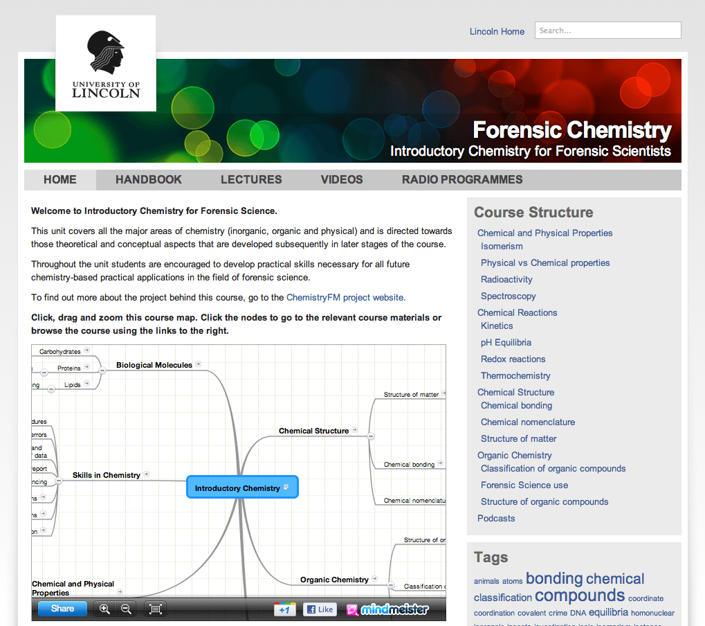
Posters at Lincoln was the first of a number of websites due to be developed at the time by OST and we recognised that this was an opportunity to create a new presentation for our websites and services. Out of the speculative design I’d worked on for the corporate site we created the Common Web Design (CWD). We dubbed it version “2.0” because there had been a sort of common design before however it was a hack, and was only similar in terms of its colour scheme and placement of the university’s logo.

Over the course of the next year this design was refined, introducing more and more features of the modern web such as CSS3 and geolocation, and we worked hard on making the design render as beautifully as possible on Internet Explorer and even forayed into responsive design with a basic mobile layout for small screen devices.

Over the course of the next year the CWD 2 design was rolled out to about 25 websites and services and I developed a WordPress theme which became the new default theme and is today used by hundreds of blogs on our network.

We also rolled out three major updates to CWD2, v2.1 “Balblair” which contained many bug fixes for Internet Explorer, v2.2 “Caperdonich” which introduced some CSS3 drop shadows, gradients and border images and finally v2.3 “Dallas Dhu” which had a responsive design and introduced geo-location lookup and enhancements for newer browsers.
Our work on the JISC funded Total ReCal project led me to start exploring alternative designs because one of the frustrating aspects of the CWD2 layout was that the content was contained in a box and try as I might I couldn’t make an elegant web application in such a small space. I spent hours playing with alternative design and was heavily inspired by the BBC’s new GEL framework.
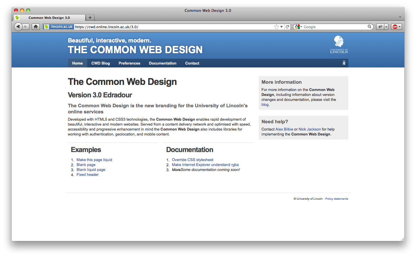
In early 2011, I rolled out CWD v3.0 “Fettercairn” (v2.4 “Edradour” sadly never saw a public deployment), which featured a brand-new responsive design, was HTML5 at the core, exploited new features of CSS3, worked in all modern browsers and was supported back to IE7. It had a flexible grid system that wasn’t contained in a box so the number of potential designs we could develop significantly increased and had some awesome CSS helper classes to achieve beautiful, flexible and clean designs. Finally I worked hard on improving the accessibility of the framework by using WIA-ARIA attributes on the HTML mark-up and developing guidelines for writing for and designing websites.

We’ve since moved CWD3 to Rackspace Cloud Files content delivery network (CDN) which uses the Akamai network; the CSS, JS and images are served from a lightening fast service with edge nodes across the world which on mobile networks makes such a difference.
Going forward, for my dissertation I’m going to be working on improving the accessibility with roaming display preferences, and Nick is exploring hooking up sites to our future messaging framework (similar to Facebook notifications but across all CWD3 based sites).
I think one important approach that we took with the CWD is that we didn’t design it for the lowest common denominator (i.e. IE7, our corporate browser), instead we tried to push the modern browsers into showing off their new features and ensured that the design and features gracefully degraded. At the end of the day, Nick and I aren’t designers but the CWD has enabled us to rapidly develop websites and applications that have consistent branding, a clean design, and browser compatibility and accessibility baked in.
Case Study Plan
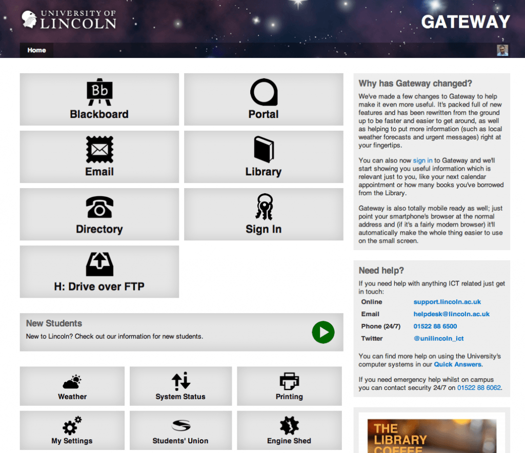
For this case study we’re going to document our implementation of our new Gateway site which uses CWD3. The current Gateway site is one of most used websites and receives hundreds of thousands of hits a month. We’ve worked hard on ensuring compatibility across both desktop and mobile browsers, improved accessibility and hooked up external services such as weather feeds and local transport services to provide a useful and feature rich service.

Over a series of blog posts I’m going to cover the decisions that were made in designing accessible HTML markup, the CSS features that we take advantage of, the JavaScript frameworks we use including our geo-location lookup service, our approach to responsive and gracefully degrading designs, and finally how all of this benefited us in our implementation of the new Gateway. These blog posts will then be used to develop our case study.